NaturVet
A packaging concept for a US maker of pet supplements and care products. We built the whole range around one hand-drawn dog who changes pose on every product, so the packs stand out on a crowded shelf.

A packaging concept for a US maker of pet supplements and care products. We built the whole range around one hand-drawn dog who changes pose on every product, so the packs stand out on a crowded shelf.
Jars, cups, pouches and sprays, each with its own pose and colour.

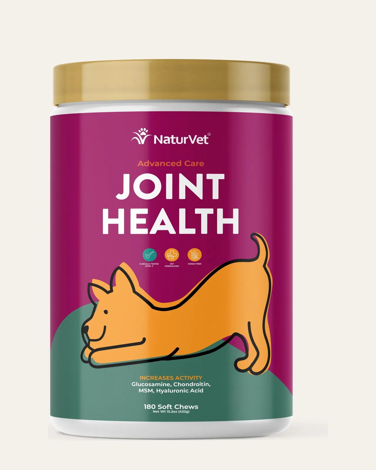

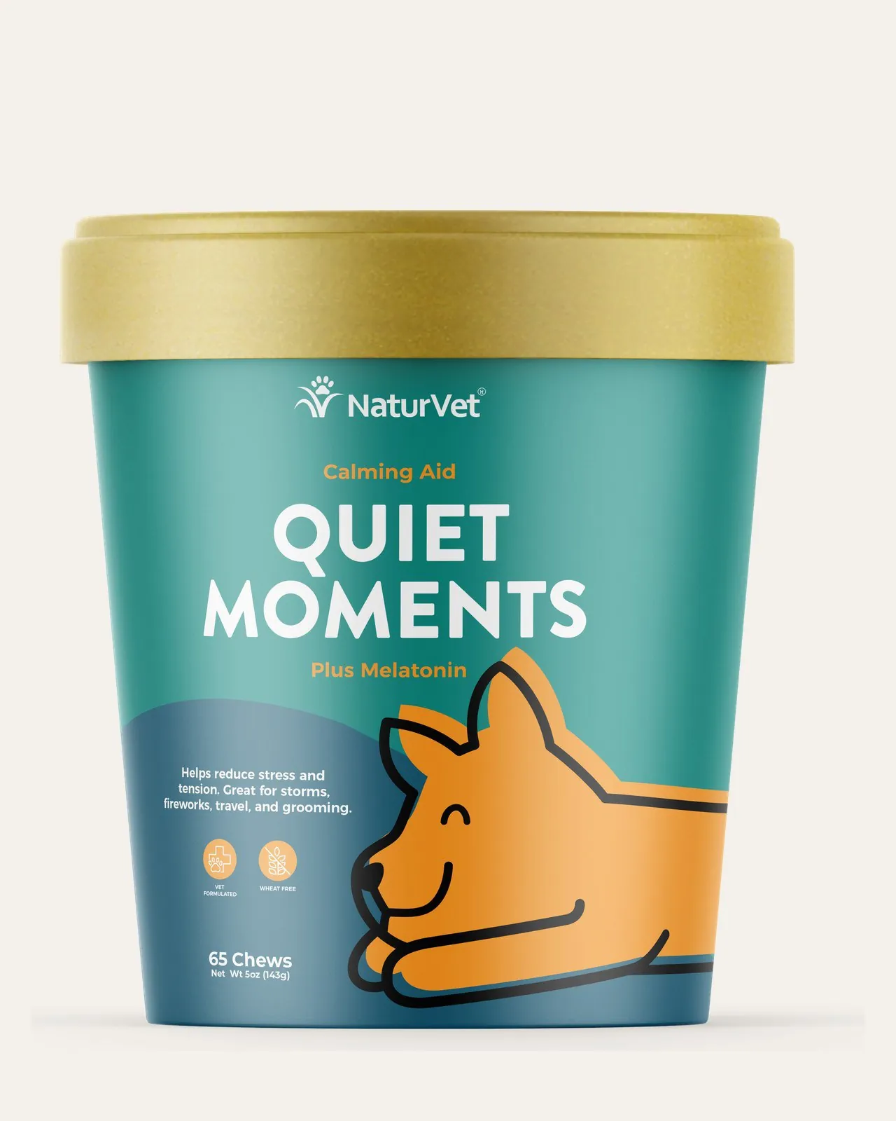
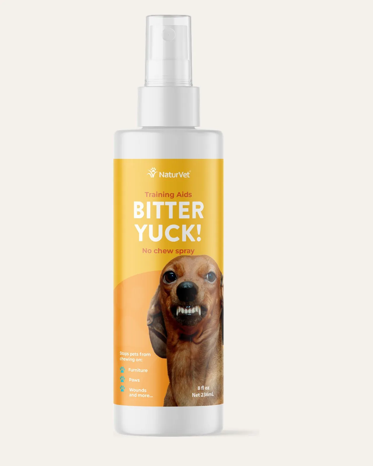
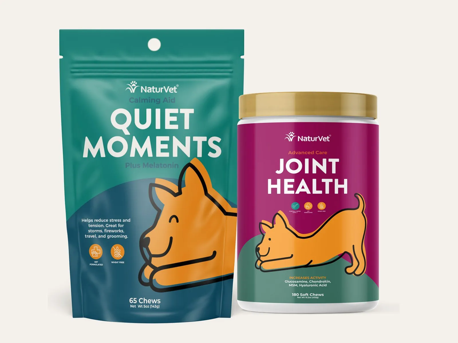


Pet supplement shelves are crowded and most packs look the same. The brief was a fresh packaging direction that a pet owner would notice from across the aisle and still trust. We gave the range a character: one hand-drawn dog who curls up for Calming Aid, stretches for Joint Health and sticks its tongue out for Bitter Yuck.
A system that grows with the range without losing its personality.
A single hand-drawn character who acts out what each product does.
Every product line gets its own colour, so people find the right pack fast.
An illustrated and a photographic version, so the brand could choose its tone.
A complete packaging system, ready to roll out across the range.
The dog, drawn in a loose friendly style that works at any size.
A colour per product line, backed up by bold type for quick reading.
Jars, cups, pouches and sprays laid out as print-ready labels.
Two finished directions side by side for the client to choose from.
Easy to extend to new products without starting from scratch.
We design packaging and brand systems with real personality. Tell us about your product and we will show you how we would approach it.


